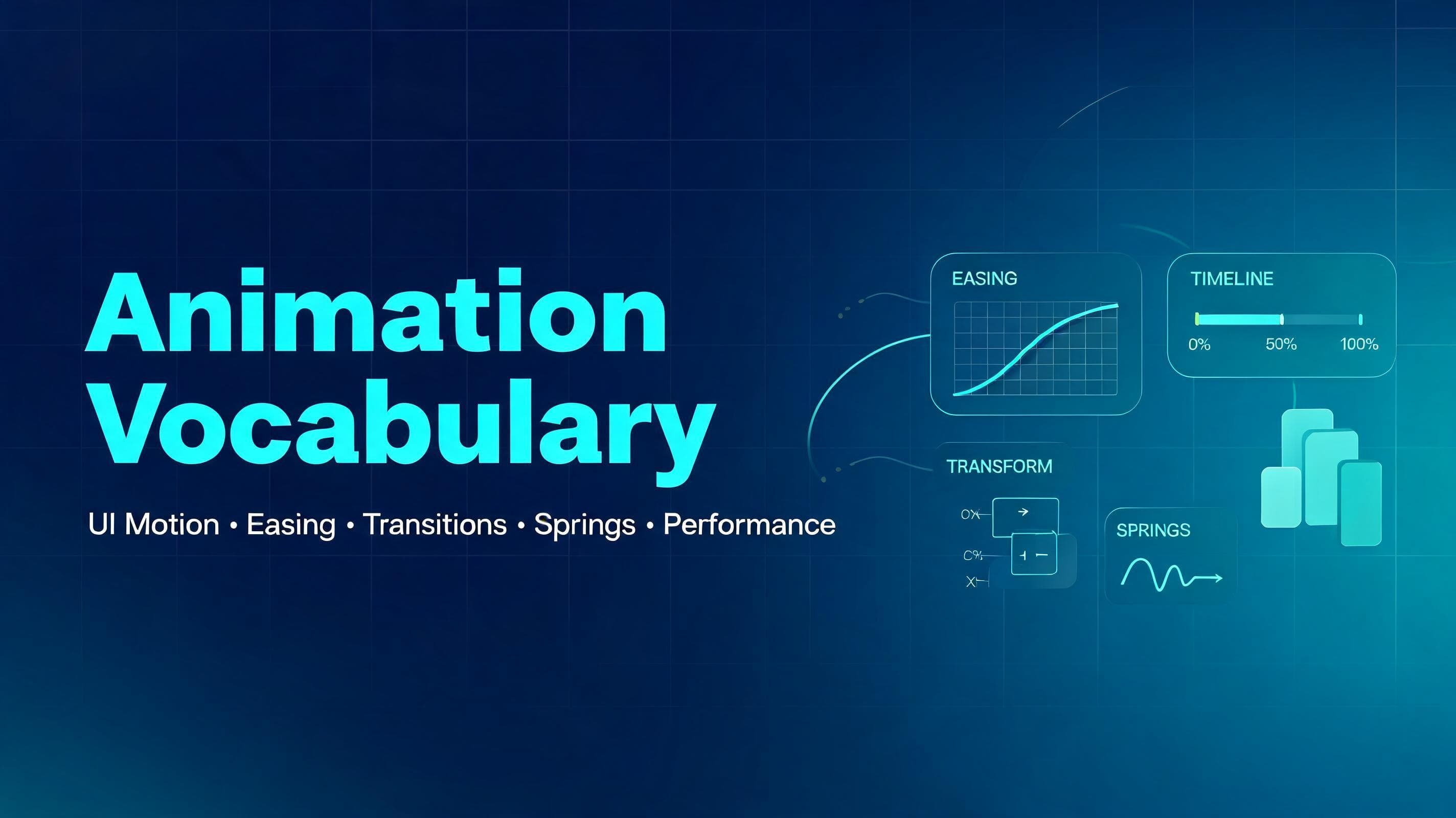
Animation Keywords
Overview
This document summarizes core animation terms commonly used in UI, interaction design, and frontend implementation. It is adapted from the source page and expanded with a few practical notes, usage hints, and implementation-oriented ideas for learning and teaching.
Entrances & Exits
How elements appear and disappear.
•Fade in / Fade out — An element appears or disappears by changing opacity.
•Slide in — An element enters by sliding in from off-screen, such as from the left, right, top, or bottom.
•Scale in — An element grows from smaller to full size as it appears, often paired with opacity.
•Pop in — An element appears with a slight overshoot, creating a playful bounce-like feel.
•Reveal — Content is uncovered gradually, often using clip-path, masks, or overflow-based animation.
•Enter / Exit — The animation an element plays when it is mounted or removed from the screen.
Practical notes
•Use short and subtle entrance animations for frequently repeated UI, such as dropdowns or tooltips.
•Avoid dramatic exit animations for actions users perform often, because they can slow the interface down.
•Good default properties for entry/exit are usually opacity and transform.
Sequencing & Timing
Coordinating multiple elements or moments.
•Keyframes — Defined points in an animation timeline, such as 0%, 50%, and 100%.
•Interpolation / Tween — The generation of in-between frames between a start and end value.
•Stagger — Several items animate one after another with a small delay between them.
•Orchestration — Coordinating multiple animations so they feel like one intentional sequence.
•Delay — The amount of time before an animation starts.
•Duration — How long the animation runs.
•Fill mode — Whether an element keeps its initial or final animated styles before or after the animation completes.
•Stepped animation — Motion divided into discrete steps instead of continuous interpolation.
Practical notes
•Stagger is useful for lists, cards, menus, and onboarding sequences.
•Too much delay makes interfaces feel sluggish; timing should support hierarchy, not decoration.
•When teaching beginners, sequencing is often easier to explain through list animations than abstract theory.
Movement & Transforms
Changing an element’s position, size, or angle.
•Translate — Moves an element along the X or Y axis.
•Scale — Makes an element larger or smaller.
•Rotate — Spins an element around a point.
•Skew — Slants an element along an axis, distorting its rectangular shape.
•3D tilt / Flip — Rotates in 3D space using transforms like rotateX or rotateY.
•Perspective — Controls how strong the 3D depth effect appears.
•Transform origin — Defines the anchor point a scale or rotation animates from.
•Origin-aware animation — Motion that appears to emerge from its trigger point, such as a popover growing from the button that opened it.
Practical notes
•Prefer transform over animating layout properties like top, left, width, or height when possible.
•Small changes in transform origin can make the same animation feel much more natural.
•3D transforms are powerful, but easy to overuse in product UI.
Transitions Between States
Connecting one state, view, or element to another.
•Crossfade — One element fades out while another fades in, usually in the same visual space.
•Continuity transition — A transition that preserves orientation by visually connecting before and after states.
•Morph — One shape smoothly transforms into another.
•Shared element transition — An element moves and transforms from one location or view into another, preserving identity.
•Layout animation — Size and position changes animate smoothly instead of snapping instantly.
•Accordion / Collapse — A section expands or collapses to reveal or hide content.
•Direction-aware transition — Forward and backward navigation animate in opposite directions to reinforce spatial logic.
Practical notes
•Shared element transitions are excellent for cards, galleries, media previews, and route transitions.
•Layout animation makes interfaces feel more polished when content changes dynamically.
•Direction-aware transitions are especially useful in step-based flows and mobile navigation.
Scroll
Motion tied to scrolling or navigating between views.
•Scroll reveal — Elements fade, slide, or transform into place as they enter the viewport.
•Scroll-driven animation — Animation progress is tied directly to scroll position.
•Parallax — Background and foreground layers move at different speeds to create depth.
•Page transition — Animation played when navigating from one page or route to another.
•View transition — The browser or framework morphs between states or pages while preserving shared visual continuity.
Practical notes
•Scroll reveal should support reading flow, not compete with content.
•Heavy parallax can feel gimmicky and can hurt performance on weaker devices.
•For practical UI work, route transitions and scroll reveals are usually more valuable than complex scroll art.
Feedback & Interaction
Responding to the user’s actions.
•Hover effect — A visual change when the cursor moves over an element.
•Press / Tap feedback — A subtle scale or shadow change when an element is pressed.
•Hold to confirm — A progress-driven interaction requiring a press-and-hold gesture.
•Drag — Moving an element by grabbing it, often with momentum on release.
•Drag to reorder — Rearranging a list while neighboring items shift to make space.
•Swipe to dismiss — Dragging an item off-screen to remove or close it.
•Rubber-banding — Resistance and snap-back when dragging past a limit.
•Shake / Wiggle — Quick lateral motion indicating invalid input or failure.
•Ripple — A wave or expanding circle from the interaction point confirming a click or tap.
Practical notes
•Feedback should happen quickly, ideally within the same interaction frame.
•Press and hover states help interfaces feel physical and responsive.
•Gesture-based motion is easier to understand when the motion direction matches user intent.
Easing
How speed changes during motion.
•Easing — The rate at which an animation accelerates or decelerates.
•Ease-out — Starts fast and ends slowly; often the best default for UI feedback.
•Ease-in — Starts slowly and ends fast; can feel heavy when overused.
•Ease-in-out — Starts slow, speeds up, then slows down again.
•Linear — Constant speed from start to finish.
•Cubic-bezier — A custom easing curve for fine-grained control.
•Asymmetric easing — A curve where acceleration and deceleration are intentionally unbalanced.
Practical notes
•Ease-out is often the safest default for entrance and interaction animations.
•Linear works best for loaders, marquees, and other machine-like repeated motion.
•Custom curves matter most when refining product feel, not when learning fundamentals.
Spring Animations
Physics-based motion instead of fixed-duration timelines.
•Spring — Motion driven by parameters such as stiffness, damping, and mass.
•Stiffness / Tension — How strongly the motion pulls toward its destination.
•Damping — How quickly the motion settles.
•Mass — How heavy the animated object feels.
•Bounce — Overshoot and settle behavior that adds liveliness.
•Perceptual duration — How long the animation feels finished to the user.
•Momentum — Motion continuing with carried velocity after a drag or release.
•Velocity — The speed and direction of movement at a given moment.
•Interruptible animation — Motion that can be redirected mid-flight without abrupt snapping.
Practical notes
•Springs are excellent for drag interactions, toggles, drawers, and interactive layout shifts.
•A spring can feel more natural than a fixed duration because it responds like a physical system.
•Beginners should learn the relationship between stiffness and damping before tuning mass.
Looping & Ambient Motion
Animations that repeat or run continuously.
•Marquee — Text or content scrolling continuously in a loop.
•Loop — Any repeating animation, finite or infinite.
•Alternate (yoyo) — An animation that plays forward, then reverses direction.
•Orbit — One element circling around another.
•Pulse — Gentle repeating scale or opacity change for emphasis.
•Float — Subtle up-and-down drifting motion.
•Idle animation — Ambient motion while an element waits for interaction.
Practical notes
•Ambient motion should be quiet and low-frequency.
•Repeating animation should not distract from reading or task completion.
•Use loops carefully in dashboards and productivity tools where constant motion can create fatigue.
Polish & Effects
Small touches that improve perceived quality.
•Blur — Softens an element or helps mask motion artifacts.
•Clip-path — Restricts visible content to a shape for reveals and wipes.
•Mask — Hides or reveals content using a shape or gradient, often with softer edges than clip-path.
•Before / after slider — A draggable comparison control between two overlaid states or images.
•Line drawing — An SVG path appearing as if it is being drawn in real time.
•Text morph — Text transitions that reshape or animate between states.
•Skeleton / Shimmer — Placeholder loading UI with animated sheen.
•Number ticker — Numbers rolling or counting toward a new value.
•Tabular numbers — Fixed-width digits that prevent shifting during updates.
•Typewriter — Characters appearing sequentially as if typed.
Practical notes
•Skeletons can improve perceived performance when real content takes time to load.
•Tabular numbers are essential in timers, counters, and analytics UIs.
•Effects should support clarity; too many layered effects often reduce polish instead of adding it.
Performance
What keeps motion smooth instead of stuttering.
•Frame rate (FPS) — Frames rendered per second; 60 FPS is the common smoothness baseline.
•Jank — Noticeable stutter caused by missed rendering deadlines.
•Dropped frame — A frame not rendered in time, creating a visible hitch.
•Compositing — Letting the GPU animate certain visual changes on a separate layer.
•will-change — A CSS hint that an element is likely to animate soon.
•Layout thrashing — Repeated layout recalculation caused by costly reads/writes or layout-affecting animation.
Practical notes
•In web UI, animating transform and opacity is usually the safest path for smoothness.
•will-change should be used sparingly, not globally.
•Performance is part of animation design, not a separate cleanup phase.
Principles to Know
Concepts that guide when and how to animate.
•Purposeful animation — Motion should clarify, guide, or respond, not merely decorate.
•Anticipation — A small preparatory movement before the main action.
•Follow-through — Secondary elements continue or settle after the primary motion stops.
•Squash & stretch — Shape deformation that communicates speed, flexibility, or impact.
•Perceived performance — Animation can make systems feel faster and more understandable.
•Frequency of use — Frequently repeated animations should be shorter and subtler.
•Spatial consistency — Motion should preserve an element’s identity across changes.
•Hardware acceleration — Leveraging GPU-friendly properties for smoother rendering.
•Reduced motion — Respecting user settings that request less motion.
Practical notes
•A useful rule of thumb: the more often an animation appears, the less attention it should demand.
•Motion should preserve orientation during layout shifts, route changes, and async updates.
•Accessibility includes motion sensitivity, not just color contrast and keyboard support.
Additional ideas
These additions are not explicit glossary items from the source page, but they are useful for teaching and day-to-day frontend work.
•Motion hierarchy — Important UI actions should have stronger visual emphasis than secondary ones.
•State clarity — Animation should help users distinguish loading, success, error, disabled, and active states.
•Temporal consistency — Similar interactions should use similar timing so the product feels coherent.
•Microinteraction — A small interaction detail, such as button feedback or toggle motion, that improves perceived quality.
•Motion budget — A practical limit on how much motion a screen or feature should contain.
Teaching suggestions
For interns or junior frontend developers, animation is easiest to learn in this order:
1.Opacity + transform basics — fade, slide, scale.
1.Timing and easing — duration, delay, stagger, ease-out.
1.Interactive feedback — hover, press, accordion, toast, modal.
1.Layout and shared transitions — reordering, expanding cards, route changes.
1.Performance and accessibility — reduced motion, jank avoidance, transform-first mindset.
Reference